Editor's note: This story is part of the WardsAuto digital archive, which may include content that was first published in print, or in different web layouts.
Anyone who has created something understands that knowing what to leave out is just as important as knowing what to leave in.
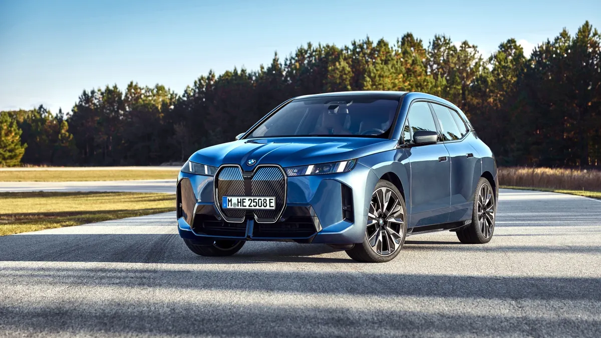
That is, everyone except the folks who design human-machine interfaces on new vehicles. They have been sticking with the “more always is better” philosophy since 2001 when BMW first confounded drivers with the staggeringly complex iDrive.
Facing massive resistance from consumers, BMW made later versions simpler to use by adding a few buttons next to iDrive’s central controller knob. But now, because engineers can’t control their addiction to making things “better” by adding stuff, the area around the latest iDrive has sprouted an array of buttons.
“When I see somebody who really knows how to use the (iDrive) system, it’s like watching someone play good saxophone, like wow, how many years did it take you to learn that?” says Dave Lyon, a former General Motors designer who now is cofounder of Pocketsquare Design, a startup that specializes in user-experience design.
Lyon was part of a panel of HMI experts at the recent SAE International Congress that advocated an intervention of sorts, insisting HMI designers and engineers stop confusing quantity with quality; stop trying to turn automotive HMIs into iPhones and stop adding features without deleting others.
Instead, they advise HMI developers to focus on speeding up the time it takes for a system to complete basic tasks such as setting up Bluetooth connections with mobile devices. There also should be a smaller number of available features, and those offerings should be highly personalized and simple to use.
And, they need to start prioritizing the needs of everyday users instead of pandering to tech-savvy early adopters who are a tiny percentage of vehicle buyers.
“We’ve really killed the tool here,” says Lyon. “You have to set a budget for features. If you work in the auto industry, you have to work with budgets. You have a budget for cost, mass and J.D. Power (consumer complaint) problems. Everything is budgeted except the features in an HMI.”
Lyon criticizes the current trend of having the vehicle display mirror the driver’s smartphone. That type of display gives each function equal visibility and importance, which is not appropriate for use in vehicles where the driver cannot be distracted, he says.
“We need to start putting in high-quality clutter-free displays,” agrees Charan Lota, general manager-Electronic Systems 1, Toyota Technical Center USA. “Just because you have a nice display doesn’t mean you have to start cluttering it and putting stuff there. We really need to refrain from that.”
HMI feature addiction is creating serious consequences, says Andrew Hart, director-Advanced Research at SBD, a market and technology research firm. “The in-car technology honeymoon is reaching an end,” he warns. “If we don’t get it right, companies outside the auto industry are starting to smell blood. They’re starting to think maybe they can do it better.”
“We need to get back to basics,” says David Taylor, from Aupeo, a subsidiary of Panasonic Automotive. We need to get away from worthless features in the car.” The back-to-basics formula includes ceasing to look to consumer electronics for every solution and instead implementing current features better. People don’t want lots of features, just good core apps that work well, Taylor insists. He says they should be easy, fast and obvious to discover.
Even though most consumers say they want streaming content in their vehicles, 240 million people, about 84%, still listen only to AM/FM radio in their car simply because it is easy. “It’s just too difficult to set up a Bluetooth connection, it takes three minutes to start the app,” Taylor says
The changes make sense, except the HMI remedy this panel is suggesting is a bit shocking: something that resembles a pushbutton AM radio from the 1950s combined with a head-up display. There is a big knob on the left for volume, and six customized preset buttons for favorite connections. The driver can operate it without looking down, and other key information is displayed at eye level on the HUD.
It’s so simple it’s scary.


